
Web Colour Scheme Help |
  |
Web Colour Scheme Help |
 29 Nov 2009, 1:15 29 Nov 2009, 1:15
Post
#1
|
|
 Officer of the European Continental Army  Group: Members Posts: 2351 Joined: 7 June 2009 From: England, Great Britain Member No.: 71 Community Manager at Nexus Mods |
Hey Guys,
I'm trying to come up with a suitable colour scheme for my website. At present I am struggling. Here is some colours thrown into various places - I was wandering if you had any advice for me. 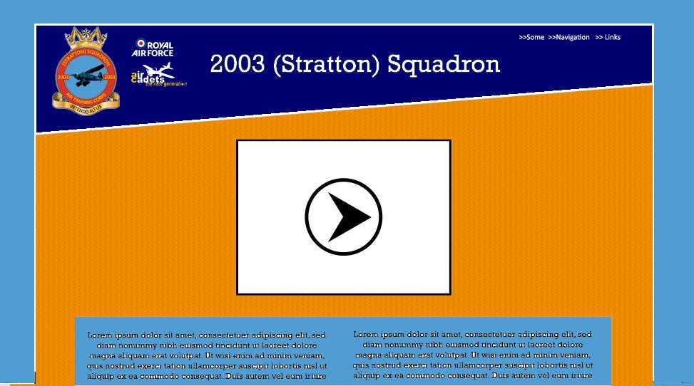
--------------------   |
 |
 
|
|
29 Nov 2009, 10:47
Post
#2
|
|
  Group: Project Leader Posts: 5870 Joined: 2 June 2009 Member No.: 10 |
Hmmm, I'm not sure. How about getting rid of all the orange in favour of some red?
That way, it'd match the colour scheme of the RAF ensign with dark blue, light blue, white and red. Change the 'header' from dark blue to red, the 'frame' from light blue to dark blue, the main background from orange to light blue, and the background of the text bodies from light blue to white |
|
|
|
|
29 Nov 2009, 19:35
Post
#3
|
|
|
Officer of the European Continental Army Group: Members Posts: 2351 Joined: 7 June 2009 From: England, Great Britain Member No.: 71 Community Manager at Nexus Mods |
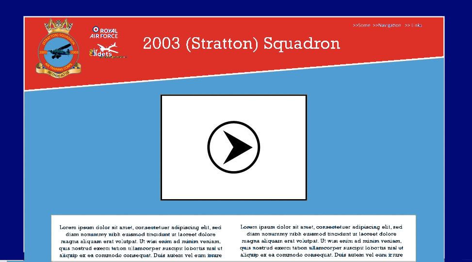
So you mean something like this?
-------------------- |
|
|
|
|
29 Nov 2009, 19:38
Post
#4
|
|
|
Group: Project Leader Posts: 5870 Joined: 2 June 2009 Member No.: 10 |
Exactly like this. Looks much better and also a lot easier on the eyes IMO. Those light blue text boxes in front of an orange
background were a bit of a clash and the conservative use of gold - which is now only in the logo - is a nice highlight. The entire logo goes very well with the red header, too. |
|
|
|
|
29 Nov 2009, 21:05
Post
#5
|
|
 Gamer Girl  Group: Legend Posts: 3808 Joined: 19 June 2009 From: Disboard Member No.: 182 Friendly Freelancer |
Agree looks a lot better thn before. Maybe you can make that symbol a bit bigger as currently it looks a bit too small.
|
|
|
|
|
30 Nov 2009, 0:21
Post
#6
|
|
|
Officer of the European Continental Army Group: Members Posts: 2351 Joined: 7 June 2009 From: England, Great Britain Member No.: 71 Community Manager at Nexus Mods |
QUOTE (Rayburn @ 29 Nov 2009, 15:38)  Exactly like this. Looks much better and also a lot easier on the eyes IMO. Those light blue text boxes in front of an orange background were a bit of a clash and the conservative use of gold - which is now only in the logo - is a nice highlight. The entire logo goes very well with the red header, too. Thanks for the advice  Do you think I should add gradients anywhere? Personally I think the light blue could do with being more washed out. QUOTE (KamuiK @ 29 Nov 2009, 17:05) Agree looks a lot better thn before. Maybe you can make that symbol a bit bigger as currently it looks a bit too small. You mean the crest or which particular logo? -------------------- |
|
|
|
|
30 Nov 2009, 1:25
Post
#7
|
|
|
Gamer Girl Group: Legend Posts: 3808 Joined: 19 June 2009 From: Disboard Member No.: 182 Friendly Freelancer |
Yes the Crest, it should be around 20 to 25% bigger IMO, depending if it will look better then of course.
|
|
|
|
|
30 Nov 2009, 3:40
Post
#8
|
|
|
Officer of the European Continental Army Group: Members Posts: 2351 Joined: 7 June 2009 From: England, Great Britain Member No.: 71 Community Manager at Nexus Mods |
Well here's a first look at a full size page....
Too big to show, so click here I think if the crest was much bigger it'd take up too much space. I don't really want the header to be bigger than it needs to be. Any further comments? -------------------- |
|
|
|
|
30 Nov 2009, 11:54
Post
#9
|
|
|
Group: Project Leader Posts: 5870 Joined: 2 June 2009 Member No.: 10 |
Looks good to me, really.
Make it so. |
|
|
|
|
30 Nov 2009, 12:24
Post
#10
|
|
 Cool Guy Group: Legend Posts: 1317 Joined: 7 June 2009 From: Sydney Member No.: 46 |
You need to spice up the background a bit, and change the colour to something that stands out less. A few faded repeating scanlines or even just a light gradient on a lighter blue.
Not as light as the first design, but not as dark as the most recent one either. This post has been edited by Murray: 30 Nov 2009, 12:25 --------------------  |
|
|
|
|
30 Nov 2009, 14:06
Post
#11
|
|
|
Officer of the European Continental Army Group: Members Posts: 2351 Joined: 7 June 2009 From: England, Great Britain Member No.: 71 Community Manager at Nexus Mods |
QUOTE (Murray @ 30 Nov 2009, 8:24) You need to spice up the background a bit, and change the colour to something that stands out less. A few faded repeating scanlines or even just a light gradient on a lighter blue. Not as light as the first design, but not as dark as the most recent one either. By the background, do you mean the main background (dark blue) or the content background (light blue area behind the video box) -------------------- |
|
|
|
|
30 Nov 2009, 14:54
Post
#12
|
|
|
Cool Guy Group: Legend Posts: 1317 Joined: 7 June 2009 From: Sydney Member No.: 46 |
The main one.
-------------------- |
|
|
|
|
26 Jan 2010, 18:11
Post
#13
|
|
|
Officer of the European Continental Army Group: Members Posts: 2351 Joined: 7 June 2009 From: England, Great Britain Member No.: 71 Community Manager at Nexus Mods |
I've now made this concept into a reality...
This is Build 001Beta... so it's largely unfinished. http://2003squadron.x10hosting.com/home.html Comments, criticisms welcome This post has been edited by Pickysaurus: 26 Jan 2010, 18:12 -------------------- |
|
|
|
|
26 Jan 2010, 19:13
Post
#14
|
|
|
Group: Project Leader Posts: 5870 Joined: 2 June 2009 Member No.: 10 |
The transition between the red and the light blue looks a bit ragged. You may want to soften it up a bit. Other than that, nice work!
|
|
|
|
|
26 Jan 2010, 21:31
Post
#15
|
|
|
Officer of the European Continental Army Group: Members Posts: 2351 Joined: 7 June 2009 From: England, Great Britain Member No.: 71 Community Manager at Nexus Mods |
QUOTE (Rayburn @ 26 Jan 2010, 16:13) The transition between the red and the light blue looks a bit ragged. You may want to soften it up a bit. Other than that, nice work! It's an on-going problem. That is .PNG at max quality and still the edge is not straight... any suggests on how to tidy it up? -------------------- |
|
|
|
|
| Lo-Fi Version | Time is now: 18 April 2024 - 1:09 |


